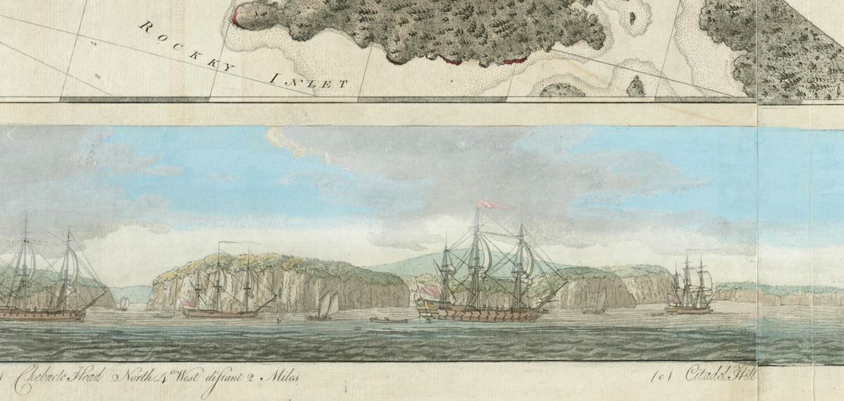
Claire Campbell

Detail, J.F.W. Des Barres, “Halifax Harbour … Catch Harbour … small vessels only” (1781), Norman B. Leventhal Map Center
I like maps. A lot. I used to study the Rand McNally Road Atlas on long car trips. Sometimes when I’m homesick I’ll meander through Halifax on Google Streetview. And this year I’m team-teaching a new course on “The Politics and Meaning of Maps.”
The Premise
This is an Integrated Perspectives course, meaning a course taught by two faculty from different disciplines. All sophomores in the College of Arts & Sciences at Bucknell are required to take one. IPs are supposed to model how scholarship works: how different disciplines converge on a single issue; how differently-trained scholars work differently, but still treat questions of evidence and argument; how to communicate with each other through differences of interpretation; how academia is, at its best and its heart, a glorious opportunity to always learn more.
My co-instructor is a digital humanist with a particular interest in early modern English drama. So if I read maps as artifacts of environmental history, of human impressions of and interventions in nature, her eye goes to a close reading of text, and her imagination goes to programs that might best serve to annotate and arrange these artifacts. Every day is a bit of an improv. Or a three-legged race.
The Framework
But we tried to build a pretty sturdy, logical framework. Class meets twice a week. Tuesdays are turned over to mini-lectures and discussion of readings. Given our mutual cartographic ebullience, we imposed strict limits of three maps each, per week, linked by a narrative thread. It’s a Lenten exercise in self-denial. These were my three for the week on colonization and settlement:

Samuel Holland, A plan of the island of St. John (1775), Library of Congress

Charles Morris, A Plan of the town of St. Andrew’s (1785), Norman B. Leventhal Map Center

John Spry Morris, Map of part of the Indian Lands in Nova Scotia – Annapolis County (1842), Nova Scotia Archives
[Samuel Holland, A plan of the island of St. John (1775); Charles Morris, A Plan of the town of St. Andrew’s (1785); and John Spry Morris, Map of part of the Indian Lands in Nova Scotia – Annapolis County (1842).]
There’s a general emphasis on the northeast/Atlantic: almost all my examples are from Atlantic Canada. It’s probably way more Canada than these students bargained for, but I’m not going to say sorry for that. We assigned the Historical Atlas of Maine as a text, but more as a subject of scrutiny, an example of different types of cartographic representation, of how an atlas is constructed. Most of the scholarship they read is actually Canadian. (Props to NiCHE here for some great examples.)
We’ve also begun using maps in discussion. We had students annotate this map of Saint John to try to make the commercial relationships of the timber economy in Graeme Wynn’s Timber Colony a bit more real.

O.H. Bailey & Co., The city of St. John: New Brunswick (1882), Norman B. Leventhal Map Center
The “Digital” Part
Thursdays, we … let them loose on the interwebs. Students look for examples of the week’s theme in designated archives, which they then upload to Omeka as an online repository, and present to the class. Incidentally, this gives students a chance to look up places of interest to them; for colonization, for example, several African-American students chose maps of nineteenth-century Africa instead of the American seaboard.
Our Omeka site is thus made up of collections that look like this:

Part of the “collection” for Week 3, Indigenous Maps and Territories.
… with entries (or “items”) that look like this:

The Omeka items are catalogued in a similar fashion as the archives they look at.
Let me be very clear. I am not a digital humanist; I am an historian who uses a computer. For me the best (only?) part of the “digital turn” is having access to more stuff. (I am kind of in the middle of nowhere.) That said, Omeka not only lets students keep track of and organize what they find, it requires them to document crucial curatorial information. It introduces them to concepts of metadata and provenance. It pushes back against the ubiquitous Google-as-shortcut.
The second program they’re using is Neatline. Neatline allows them to annotate particular features on historical maps (as with the map of Saint John).

Over the course of the semester they’re creating an historical gazetteer of New England, a compilation of three base maps with certain features (towns, harbours, rivers, etc.) annotated in 1500-word essays. These annotations also have to include primary sources, so we’re introducing them to databases like Artstor and America’s Historical Newspapers. They can put what they find here in their Omeka collections, too.

What about early Canada?
It may not be a history course, but it sometimes feels like one. The first part of the course has been familiarly chronological in terms of [environmental] history: exploration, Indigenous lands, settlement, harvest, etc. But – in the theme of metadata and epistemology – we keep coming back to thinking of maps as artifacts: as intellectual and commercial commodities, the politics of publication, in/equality of representation and access to information. A lot of the larger, grander, published maps (by Bellin, Jefferys, and the like) are quintessential representations of metropolitan claims to place as well as to “universal” knowledge, and thus embodiments and instruments of imperial power. These are the maps that find their way into sanctioned institutional settings, be they classrooms or post offices. The manuscript maps are harder for students to read, on several levels.

Which maps get read? The much-reprinted The American Geography (1792) by “the father of” same, Jedidiah Morse. (Sidenote: Morse’s version of the British/American border was … interesting. Back off, dude.)

In the second half of the semester we slide off chronology to consider maps in alternative formats and popular culture, be they three-dimensional, literary, or pictorial.

Detail, The Main Line: A Historical map of Ye Outlying Regions (1946). IT WAS COLD WE GET IT.
For environmental history in particular, maps are terrific. They’re inescapably about human agendas and human interventions in the natural world. For millennials, maps are Googlized: functional, convenient, but abstracted, flat, dehumanized space.

But historical maps let us repopulate the landscape. In style – and, it has to be said, their strangeness – they unsettle a complacent or uncritical reading to reveal both the process and product of mapping. Text, names, illustrations (in the cartouche) – elements of proportion, distortion, detail, and erasure: all serve to convey ideological and political messages.
They chart nature as territory (realistically or otherwise):

Vincenzo Coronelli, Partie orientale du Canada ou de la Nouvelle France (1689), in which France somehow lays claim to most of the North Atlantic.
… or as resources for extraction …

Philippe Vandermaelen, Grand Banc de Terre Neuve (1827). A transcription of the narrative – half about fishing, half about clubbing seals – is here or here.
… as property and evidence of “improvement” …

J.H. Meacham & Co., Illustrated Historical Atlas Of The Province Of Prince Edward Island (1880). “Park Corner” belonged to L.M. Montgomery’s grandfather.
… as symbols of self and other as defined by or in nature…
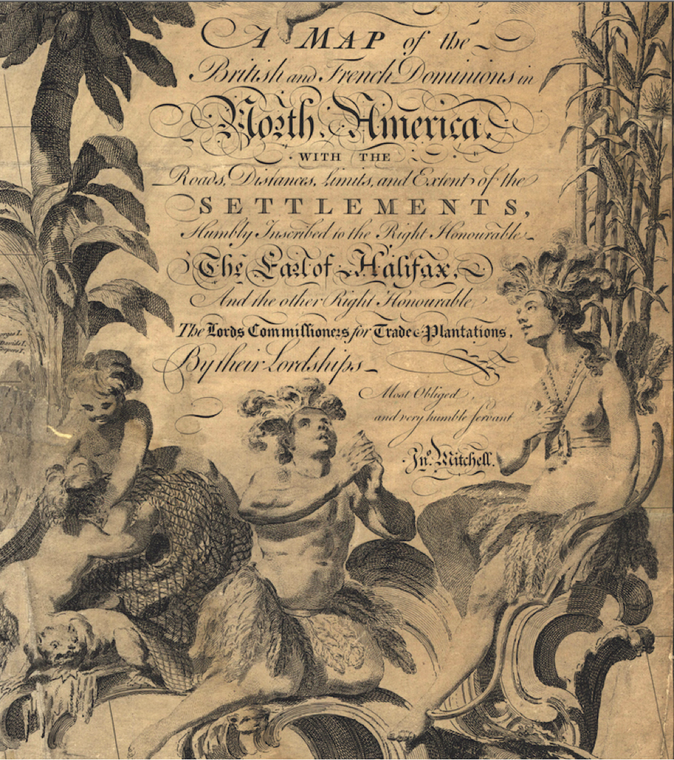
Detail, John Mitchell, Thomas Kitchin, and Andrew Millar, A map of the British and French dominions in North America (1755). I found Canada Before Confederation: Maps at the Exhibition (2017) a useful and thought-provoking read for several of these.
… as evidence of the priorities and limits of scientific knowledge.

Detail, Samuel de Champlain, Carte geographique de la Nouvelle Franse faictte par le sieur de Champlain Saint Tongois cappitaine ordinaire pour le Roy en la Marine. Faict len 1612
Who knew that trees in seventeenth-century Canada were so tidy?
The challenge is that with minimal historical background, the maps have to tell the story. The great thing is that with minimal historical background, the maps can really tell the story.
As I do in most of my classes, though, I’ve wondered about the optimal balance for an environmental/ist historian. Is this about supplying students with context, or about the long view? Are these maps illustrative of historical eras, or of recurring patterns? Are we talking about the past or the present? If we are mapping the continental shelf for fossil fuels, and claiming it for a single state, is that more similar or different from mapping the same shelf for fish five hundred years ago?

 Giacomo Gastaldi, La Nuova Francia (1556). Partial Submission of Canada to the Commission on the Limits of the Continental Shelf (2013) Is it fair to present these in the same week, or ahistorical?
What should I do when we talk about coastlines and climate change? Should we look at the Atlantic Neptune, or maps of the Northwest Passage during the Little Ice Age, or NASA satellite images of Hurricane Sandy and NOAA datsets? I feel like I invoke this a lot, but as an environmental historian, I sometimes feel about Douglas LePan’s description of an archipelago – “angels alone would see it whole and one” – is the most apt way of conveying the scale, depth, and complexity of the most pressing environmental issues.
Claire Campbell, a Professor of History at Bucknell University, is interested in the environmental history of North America and the North Atlantic world. She has taught at universities across Canada and in Denmark, in the areas of history, Canadian Studies, and Environment and Sustainability. Publications include Shaped by the West Wind: Nature & History in Georgian Bay (2004), A Century of Parks Canada, 1911-2011 (2011), and Land and Sea: Environmental History in Atlantic Canada (2013) with Robert Summerby-Murray. Her most recent work, Nature, Place, and Story: Rethinking Historic Sites in Canada (2017), uses environmental history to expand public history and discussions of sustainability at national historic sites. She’s currently working on a new project, “The Islands of Canada: Canada as a Coastal Nation.”
Useful Links
Admittedly, these are a bit American-centric, but as Jeffers Lennox said in an earlier Borealia post, “pre-national maps really demonstrate how fluid and imagined were most boundaries in the early Canadian / American era.” Finding Canada in these archives helps American students realize that no, the continent doesn’t end at the north end of Maine; and may help Canadian students see some of their country’s story in what happened south of the much-later-border.
David Rumsey: http://www.davidrumsey.com/
LOC: https://www.loc.gov/maps/collections/
Norman B. Leventhal Map Center, BPL: http://www.leventhalmap.org/
John Carter Brown: https://jcb.lunaimaging.com/luna/servlet/JCBMAPS~1~1
Osher Map Library, University of Southern Maine: http://www.oshermaps.org/
Nova Scotia Archives: https://novascotia.ca/archives/maps/
NYPL: http://digitalgallery.nypl.org/nypldigital/explore/dgexplore.cfm?topic=history
Featured image: Detail, J.F.W. Des Barres, “Halifax Harbour … Catch Harbour … small vessels only” (1781), Norman B. Leventhal Map Center

I have always loved maps for most of the reasons you outline here (and old movies for much the same reasons). I too spend much free time enjoying maps, both current and historic. I wish I could take your course, but I graduated from Bucknell in 1972! Any chance of an online version?
Always fascinated by maps old and modern, I included the concepts of maps and mapping in a university course I developed on computing and data, discussing how maps of the same place can be drawn for different purposes (road maps to guide the traveller, tourist maps, hydrological and topographical maps, etc. and how these purposes affect the visualization of place). I have a large collection of antique maps of a single county (Bedfordshire in England, where I lived for 25 years), the oldest being a mid-16th century map and the greatest number of my collection showing the development of railroads in the 19th century (some railroads planned or hoped for, but never built included!). If you do this as an online course, please remember me! I’d love to join in, to see maps in even more ways.